
Water Sort Puzzle Redesign and Rebrand
New
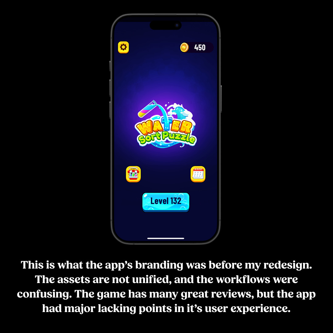
New vs. Old: What do you think?
Old
Want to try it yourself?
Try the prototype below!
I decided to redesign and rebrand some of the workflows in Water Sort Puzzle, a highly rated mobile game with a 4.7-star rating on the App Store. While the gameplay is engaging and enjoyable, I identified significant usability issues, particularly with the user interface and workflow navigation. As the design is currently, the game is very inaccessible for people with visual impairments. The color palette lacked accessibility considerations, which I found out by applying the colorblind setting to my phone with the app open. This pointed out many issues with how the colors are viewed directly next to each other. This renders the game almost unplayable to anyone with any amount of colorblindness, as the whole game revolves around matching and sorting different colors. To address these challenges, I reimagined the branding and redesigned a core user flow using Figma.


Programs Used:
Figma, Photoshop
Other Documents


